Canadian Advance Senior High (CA High) is an online school that accredits students with the OSSD certificate (Ontario Secondary School Diploma) upon completion of their online curriculum program.
Problem
The current website is super lengthy and failed to deliver relevant information to user. Viewer also questioned the credibility of the school -> resulted in a lack of sign up from independent user.
Outcome
I co-led the end-to-end redesign and rebrand of the CA High’s main website. The results showed a 37.8% increase in the visit rate and a 15% increase in the contact rate during the first quarter after release.
This redesign is from 2 years ago, the current website have experienced new updates
🗄 The Background
The purpose of the website
Without a physical campus
the website is the first thing any potential client or students first encounter.
🔦 Provides an online presence for the school, allowing potential customer to find key information (i.e., school mission, values, types of program, partnership, course offerings and contact.)
✅ Convey the school’s identity, value and uniqueness. Provide a sense of credibility and trustworthiness of the business.
⚠️ The Problem
The website is not doing so great...
There is a lack of sign-up from independent students, 95%+ of students were introduced by overseas partnerships or agents.
Now because of COVID, the school is unable to host partnership events, so the situation becomes more severe.
Current website is super lengthy and fails to deliver relevant information to viewers. Viewer also questioned the credibility of the school.
⭐️ The Outcome
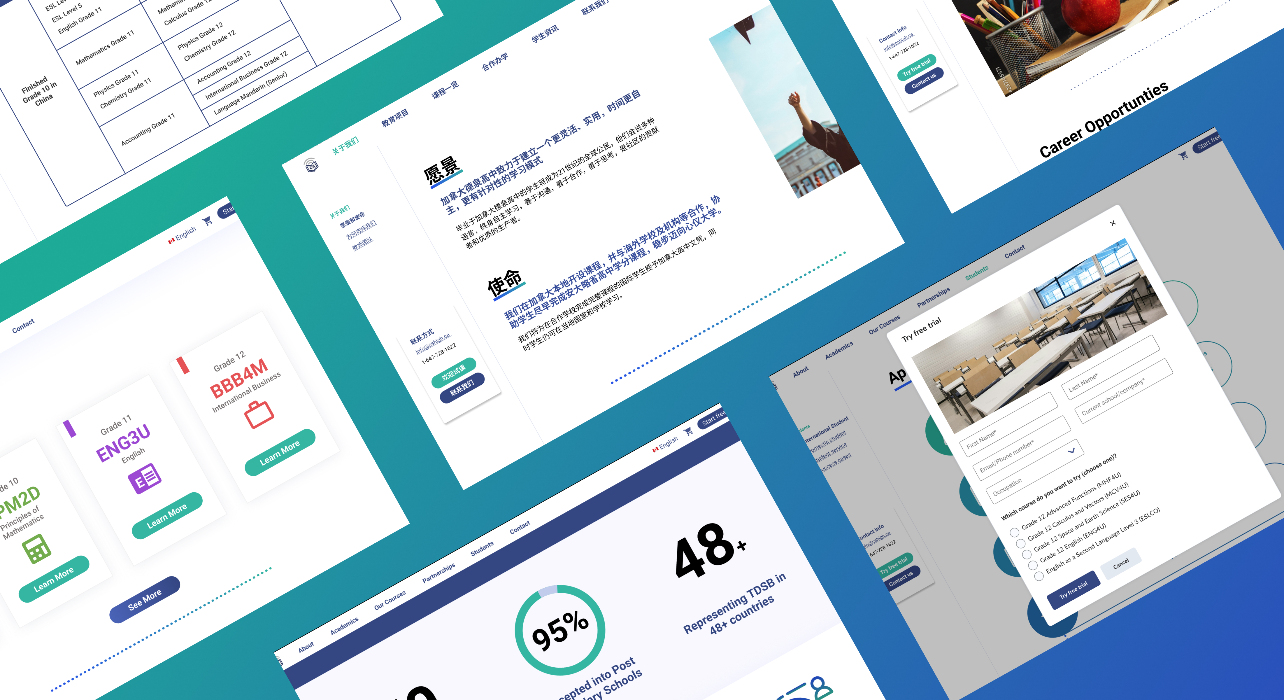
Over 3 months, I led the complete redesign and rebrand of Canadian Advanced Online High School's main website. We delivered enhanced navigation, a clear information hierarchy, concise messaging, and a refined user interface that underscores the school's credibility.
New Homepage
Highlight unique and credible aspects of the school, such as program highlights, featured courses, partner schools, and the Ontario school certificate.
Personalized content
Content available in both Chinese and English for Chinese international students. Tailored information based on user roles: student, parent, or educational agent.
Easily accessible next step
We encourage specific actions (like contacting us) and highlight important info (like free trial) in a sticky sidebar for easy access and to maximize traffic.
📊 Impact
37.8% +
We have significantly increased the visit rate within the first quarter after launching the new website.
Users spent significantly longer time on the website, showing their interest in the content and their willingness to learn more about the school.
15% +
The contact rate also increased significantly compared to the same period last year.
We have received many positive feedbacks from partnering school agents about how the new website is helping them with their business.
🗺️ The Process
Being the UX lead of the team, I am responsible for creating and executing the project plan for the whole team.
How might we improve the CA high website so that users can efficiently find relevant information and regard the school as a credible and trustworthy institution?
But, how do we do that?
01
Understanding problem space
Understand school operations, issues, resources, timeline, and project goals. Stakeholder request: Rebranding and polishing Project timeline: 2.5 months for design and development to meet the application season deadline"
02
Define Project Scope
Focus on two user groups: Students and Agents. Goal: Increase individual student sign-ups. Consideration: Account for Agents due to their role in partnerships.
03
Create Plan
A written plan helps group members stay on track. I've created a detailed design plan on Notion with clear objectives and deadlines. I also provided resources on UX research, including interview and usability testing guides
04
Collaboration tool
Good collaboration tools are essential for remote work. - Notion: project planning and tracking, resource collection, meeting note record - Miro: exploration and research analysis - Zoom: team meeting platform - Figma: design and hand-off document
❤️ Understand
Short project timeline + lack of research resources. We need to be creative with understanding the problem space without conducting user research.
I decided to analyze the website through our design expertise and by referencing Nielsen Norman’s 10 Heuristic principles.
1 - Where is the relevant info?
Lack of organization
Content are scattered in different places. Lack of proper categorization and labeling.
Lots of irrelevant information
Supplementary content such as <school safety> and <academic honesty> have occupied the majority of the website
Long loading timerequired to download document to access information.
2 - Doesn’t feel professional
Messy design
Inconsistent font style, color and template usage
Lack of info that shows the legitimacy and uniqueness of the school:
Value statement, success case, course/program pricing, testimonial, partnership procedure and details.
No sense of connection:
Images used on the website are all stock image featuring a population that is far from what the school represents.
💡 Explore
Prioritize Ideas
Trade off feature, functionality, cost and impact
Impact: how much can this idea help our user Feasibility: is this idea doable, how much does it cost - time and money wise.
Solution Items
🏛️ Rearchitect Info
Reorganize the information architecture into logical groups and highlight relevant info.
🗑️ Simplify content
Use visual elements (i.e., process map, table view) to replace or segment lengthy messages
🎨 Re-brand
Apply consistent design components that match the style of the school
📒 Design system
Organize a library of visual elements and template that can be reused in the future
🏛️ Rearchitect info
Before
Looks like there are lots of content, but I can’t find what I am looking for
Repetitive content
Content like 'course table' and 'course list' contains similar information presented differently, as do 'program info' and 'about us.
Bad representation of content
About us' and 'program info' are presented as lengthy PDFs or text, causing slow load times and requiring extensive scrolling.
How did we redesign the Information Architecture?
01 Information Architecture Analysis
Take a closer look at all the content and highlight where important information is currently located and what are the missing information
02 Object Modeling (simple version)
We organized blocks of information into different object (represented by cards), then identified their relationship to each other and their significance to users' workflow. Then started building the first IA structure
03 Card sorting activity
It is always necessary to test our assumption of the IA structure so I also conducted some casual card sort activity. Unfortunately, we don’t have time to recruit real participants to do this activity, so I utilize my human resources (my friends) to help with the testing.
04 Competitor analysis
As another way to validate the proposed IA is t benchmarked other educational websites (e.g., Rosedale Academy, Ontario Virtual School, British Columbia Online School, etc.)
❓ My struggle
At CA High, the ability to earn OSSD (The Ontario Secondary School Diploma) is a key selling point, but I have been struggling with highlighting this point.
💡Rosedale Academy’s approach
Perhaps the easiest way to highlight info is to put it on the Nav bar, because this is a part that user spent a lot of time looking other than the homepage.
05 Rounds and rounds of iteration
After that, we presented the newly formed IA structure with stakeholders to understand if there is any constraints and if they are satisfied with the change. As expected, stakeholders wanted us to add some information ( highlight their education programs) and told us about the constraint we faced with others (unable to provide detail faculty info) and that lead to a few more rounds of iterations
After #1
A more intuitive information architecture
After #2
A more intuitive workflow
Sticky nav bar
Efficient access to contact info and other related sections. Prompting user to proceed to the next step -> contact us or learn more about the school.
Direct path based on your role
Providing the most relevant information for student and agent based on what they are interested in so users don’t need to spend time finding info.
🗑️ Simplify Content
New representation of lengthy content that enhanced scanability
🎨 Rebrand
To convey legitimacy and professionalism, we chose cool tones like blue and green as primary colors, with gradient highlights for select areas.
📒 New Template
We created a design library of reusable components for the new UI, serving as a reference for future designers.
🔬 Test
Usability Testing
Identify WHERE and WHY users struggles when using the website (especially those that harm their impression of the website)
I’ve led 6 semi-structured interviews (20min interview, 30min website walkthrough) with 3 highschool students and 3 agents.
Satisfied with the new IA and UI design
Content are scattered in different places. Lack of proper categorization and labeling.
Still missing information
when is the school established, number of student enrolled, real pictures, etc.
Localization
The targeting user is Chinese international student, but all materials are only provided in English.
Iterated Design
We incorporated the feedback and included Chinese translated content, school history info as well as more detailed student enrolment info.
We also created a design library of reusable components for the new UI, serving as a reference for future designers.
✅ Design Hand-off
Ensuring the best delivery
We primarily used Figma for design hand-off. Each screen is organized in different sections with notes attached and spacing detail defined.
We also meet with the developer on zoom or communicate on Facebook to make sure that there is no question and concern.
When the implementation is complete, another designer and I take turn QA the website and we organized a document that list out problematic areas