The Daylight Design System is D2L's design language that ensures a consistent user experience across all products and devices. It is built on three pillars: simplicity, friendliness, and engagement.
From 2023 to 2024 (2 months), I contributed part-time to the Daylight Design System and UI Platform team, enhancing our design system to meet cross-functional use cases for Brightspace (our core learning management system).
My role and responsibilities
- Research - UI design - Prototyping - Document write up
Outcome
I designed a new component "colour indicator" that helps with Lesson tool's use case and enhanced the navigation confusion of our highly-used nested list component.
Daylight is a dynamic design system that brings harmony to all of D2L's products, no matter the device or market.
Our goal is to provide a seamless user experience on a large scale, which means regularly updating the library to meet everyone's needs.
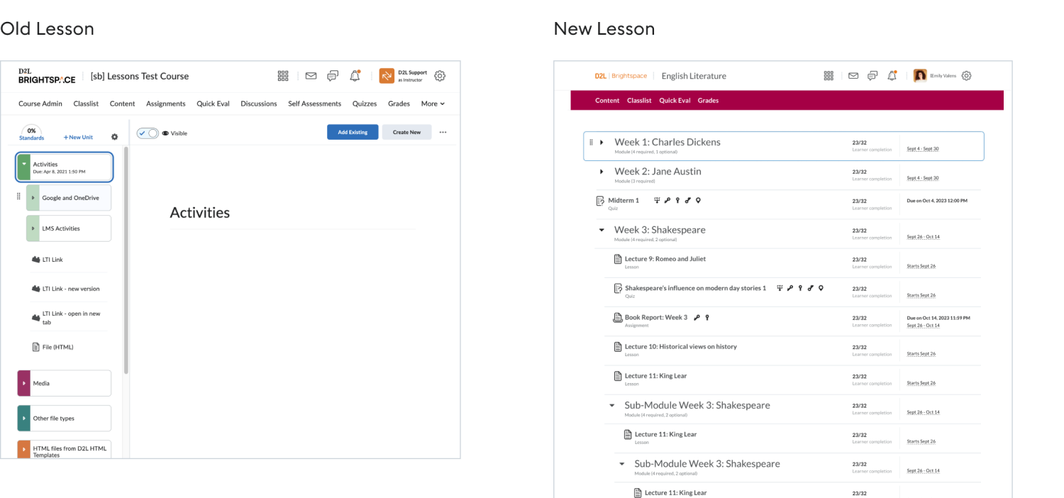
The nested list component, a staple in Brightspace, is frequently used but has a few issues.
Need 1
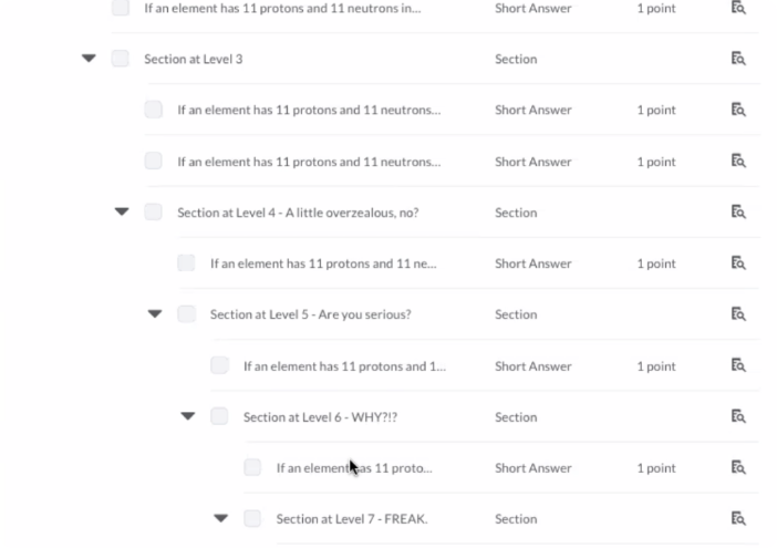
Nested list hierarchy issue
1 - Easy to get lost in deeply nested lists
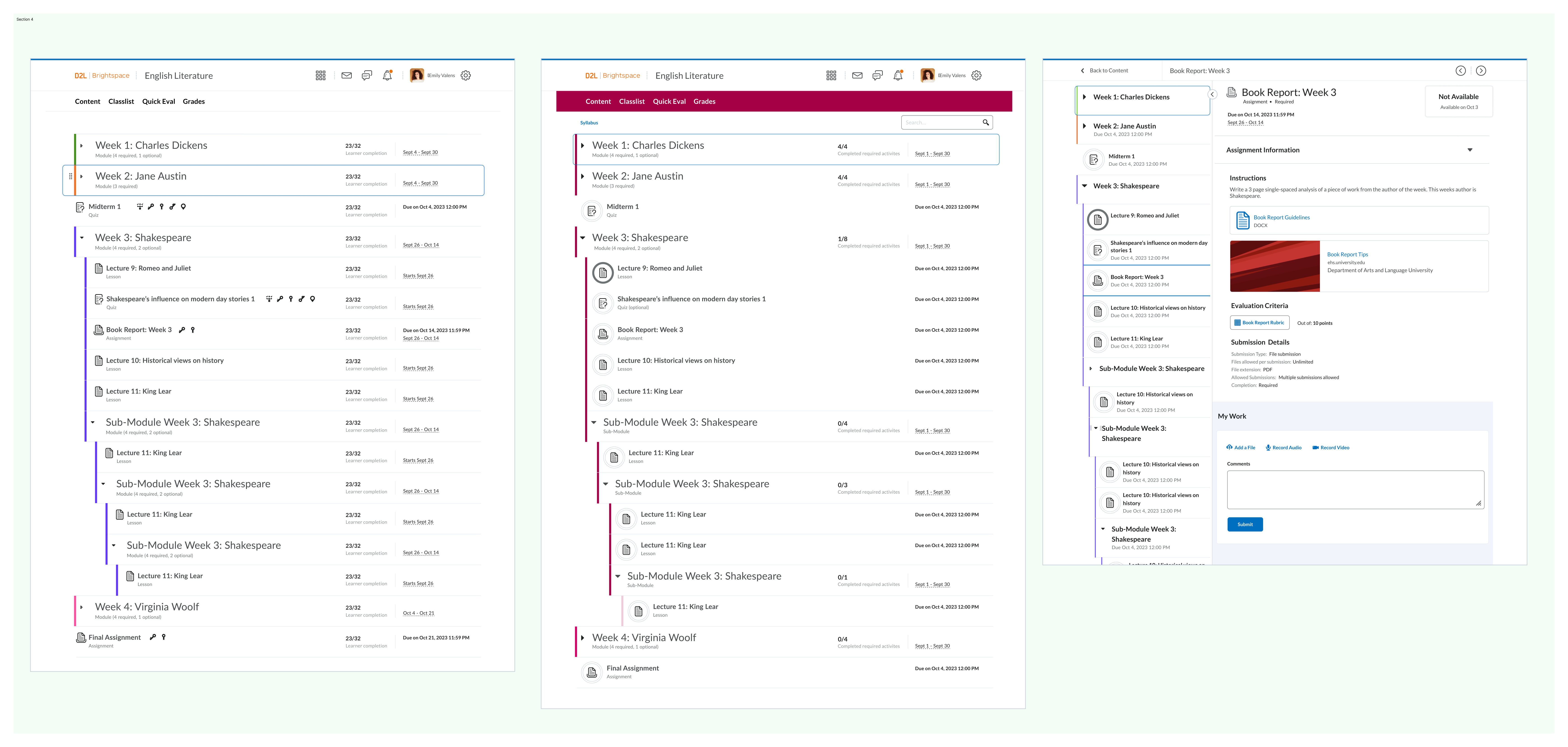
Default state: Visualizing the hierarchy between parent and child elements is tricky, making it hard to tell which level you're on.
Drag and drop state: It's unclear which level the list is being dragged or moved into.
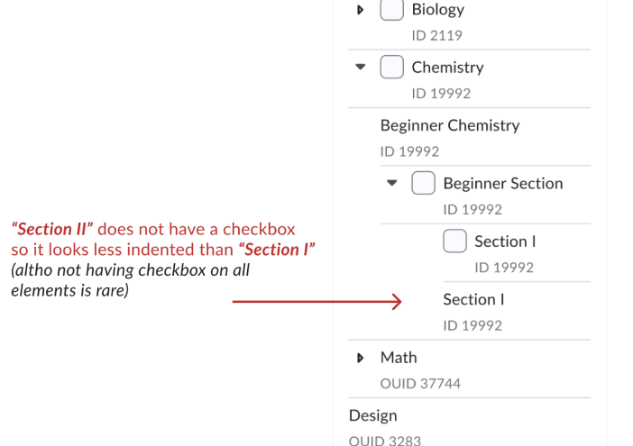
2 - Each control (checkbox, collapsible/expandable button, drag-and-drop button) takes up space on the nested list component.
As a result, the parent and child list can appear at the same level if the parent list has more interactive components than the child list.
Need 2
Lack of support for existing functions
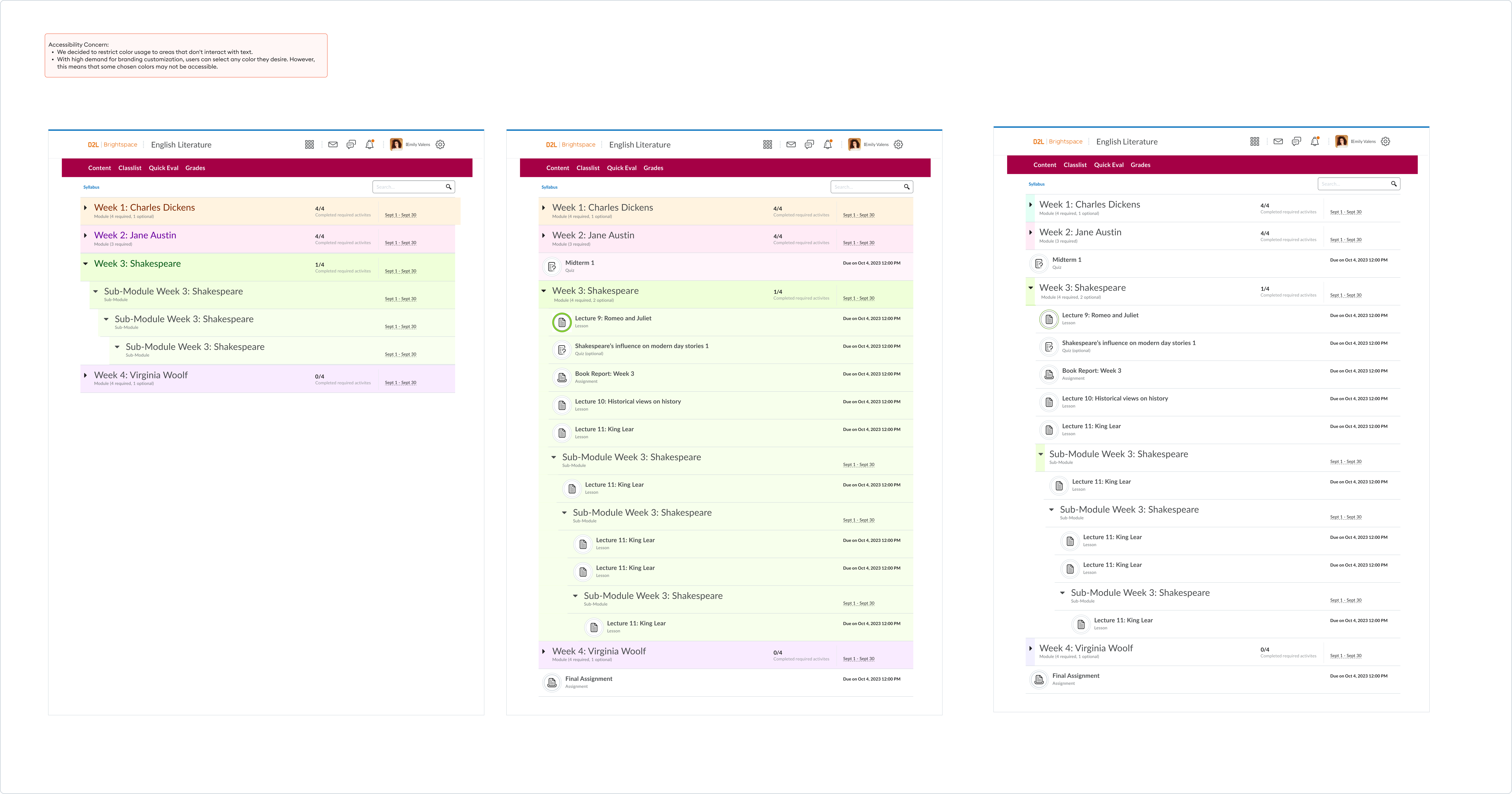
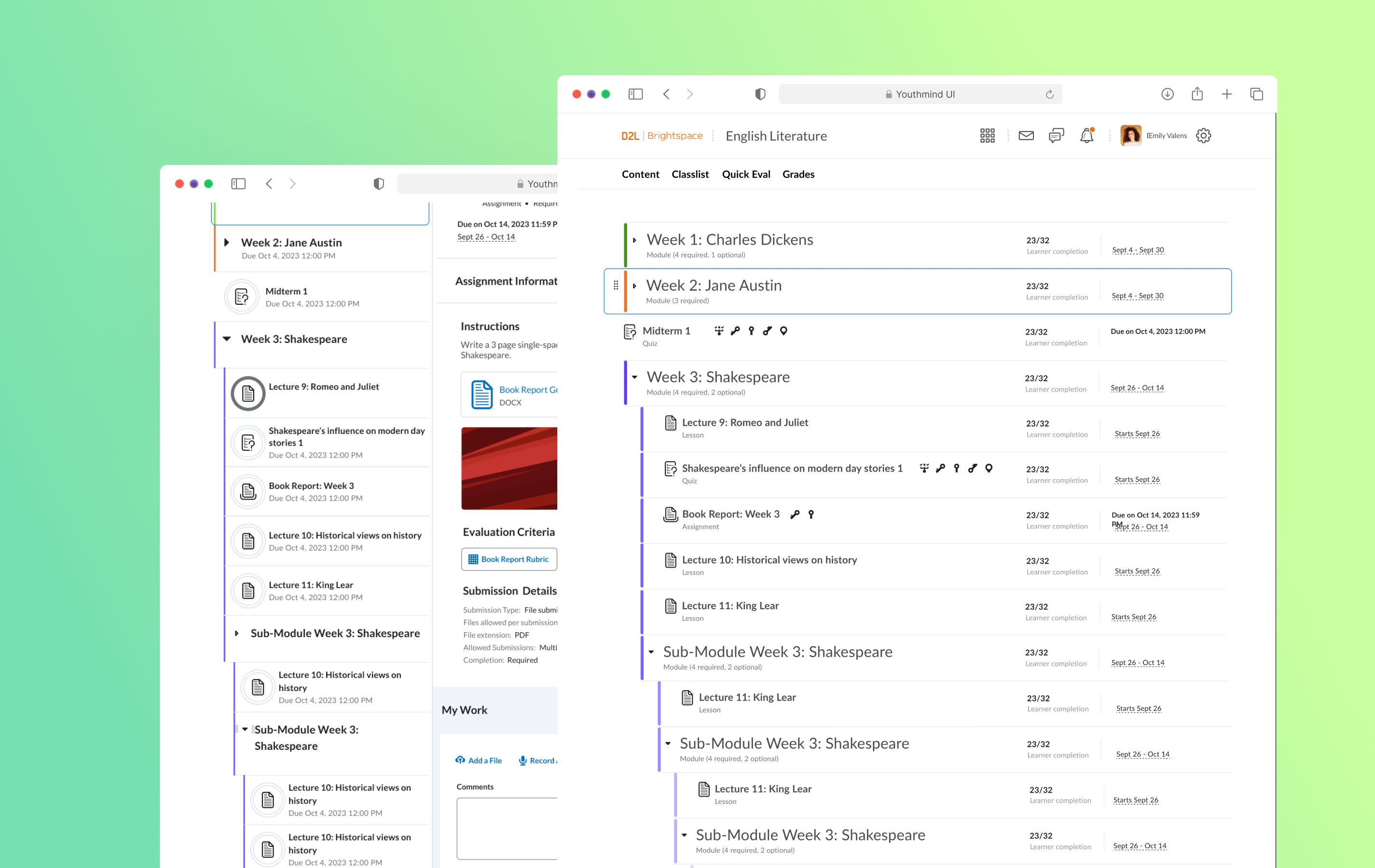
The Lesson tool is moving to a new UI that uses the standardized Daylight nested list component.However, this component does not support the module color differentiator, a crucial feature needed by our K-12 user group.
🗂️ Content Organization: Instructors use different colors to code lesson modules, helping younger learners easily find lesson materials.
🎨 Engaging Space for Young Learners: While Brightspace's minimalistic design appeals to higher education, younger learners prefer a more colorful environment.
My objective
Since both needs are tied to the nested list component, I took on the project, aiming to find solutions that address the 2 needs.
🗺️ The Process
Designing components for UI-specific projects follows a slightly different path compared to regular product design. Most of the time was spent exploring various UI ideas to identify the best solution and establish a new standard.
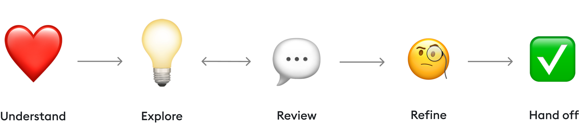
💚 Understand
System analysis
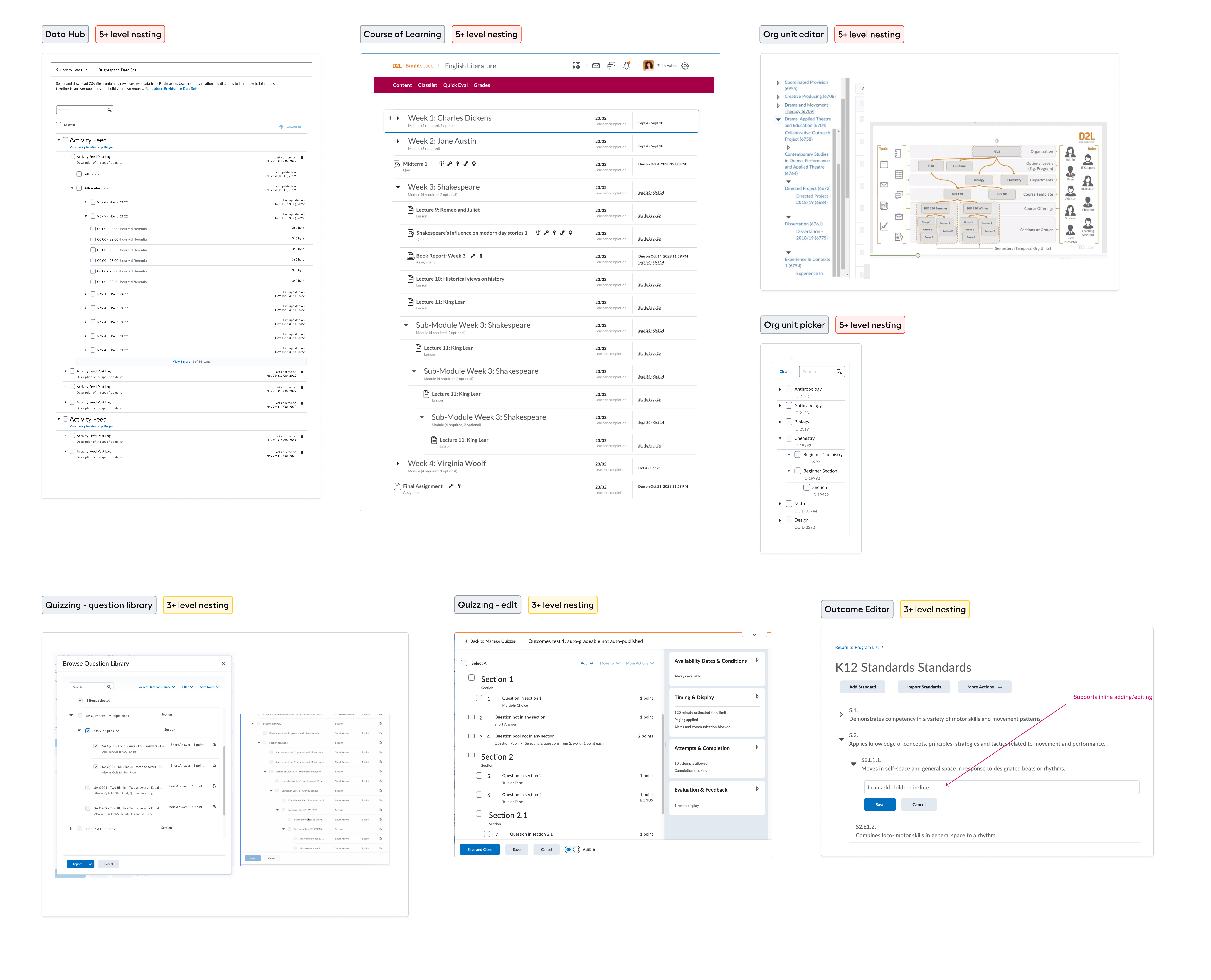
The nested list is one of the most used components across Brightspace LMS, featured in over six tools. Each tool utilizes this component differently, so I needed to understand all the requirements and use cases to design a solution that enhances rather than disrupts existing workflows.
01. Work with both large and narrow frame
02. Work with drag and drop functionalities
03. Should be subtle and not distracting
04. Need to work for both instructor and learner list view
05. Work with Hover mode
06. Support multi-colour
07. Support single-colour
08. Consider indentation problem when theres’ checkbox and collapse/expand button in the list
💡Explore: need 1
Deeply nested lists are a common feature across the web. I started by examining platforms like Reddit and others to see how they handle hierarchy issues.
After some research, I came up with five ideas.
Idea 1:
Arrow point towards next line
👍 Pro: Clearly shows which level each list belongs
👎 Con: - Introduces excessive visual noise on screens with narrow frames (e.g., drop-down menus). - Alignment issues in edge cases where some lists use "extended/shortened divider lines."
Idea 2:
Reddit thread
👍 Pro: Easy to identify the nesting level
👎 Con: Creates excessive visual noise, making the screen feel busy.
- The benefit is not as valuable since most lists are in a "static view." Users aren't required to move list items around, so there isn't much value in knowing the nesting level.
Idea 3:
6px Gradient line
*This is an idea originally proposed by Lesson Designer (P. Beh) that aims to add colour to the nested list.
👍 Pro: - Clearly shows the child and parent list relationship. - Help identify hierarchy when child list and parent list has the same level of indentation. - Can support multi/single colour requirement
👎 Con: - Still too much visual noise for narrow screen
Idea 4:
Grey line
👍 Pro: - Least visual noise added - Shows the child and parent list relationships.
👎 Con: - Doesn't look like a list anymore - Visually unbalanced to be covered on one side of the list but not on the other side.
Idea 5:
Combine idea 2 + 3
👍 Pro: Provide the benefit of both the reddit approach and the 6px line approach
👎 Con: - Implementation concern (NDA info)
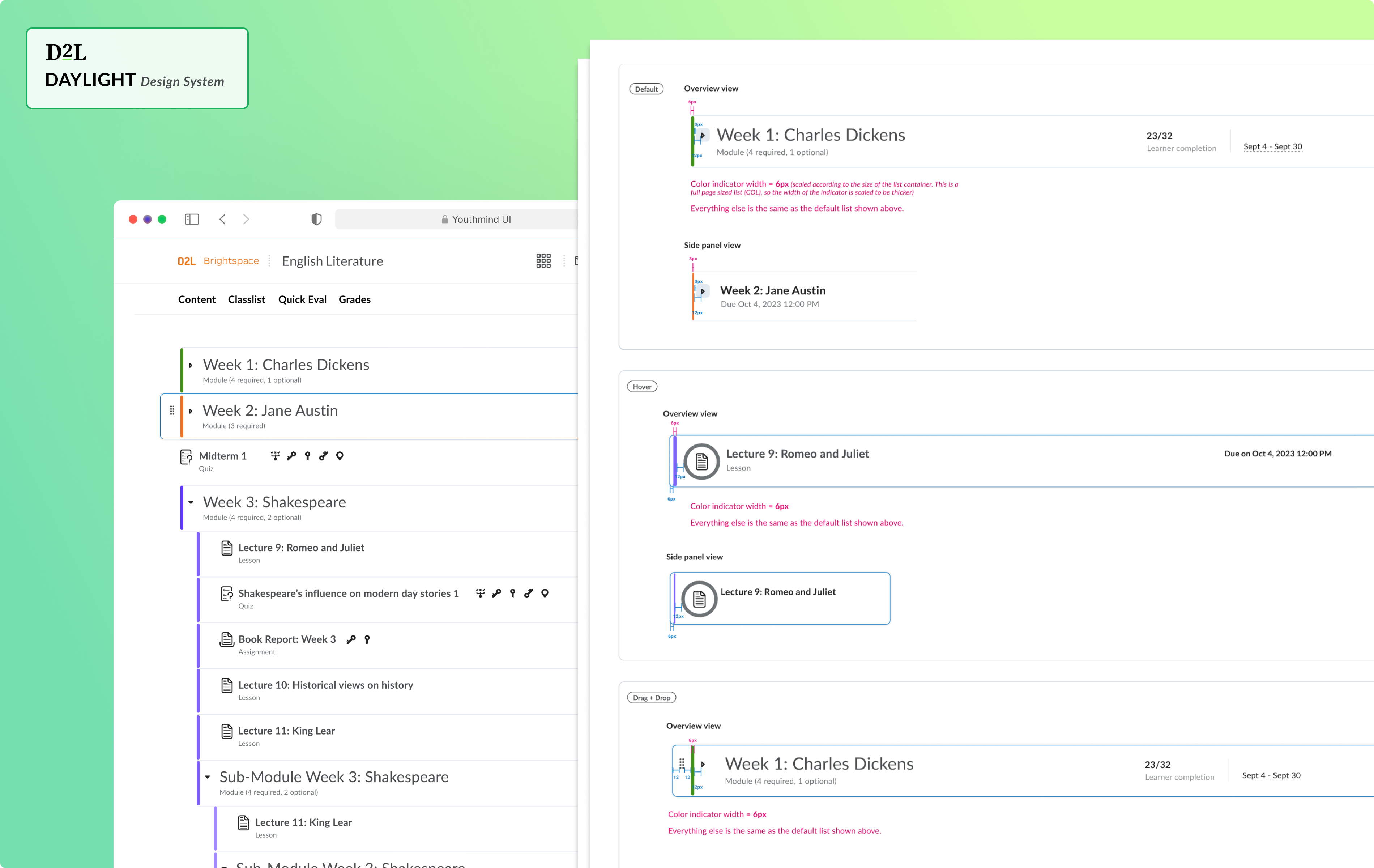
Final Solution:
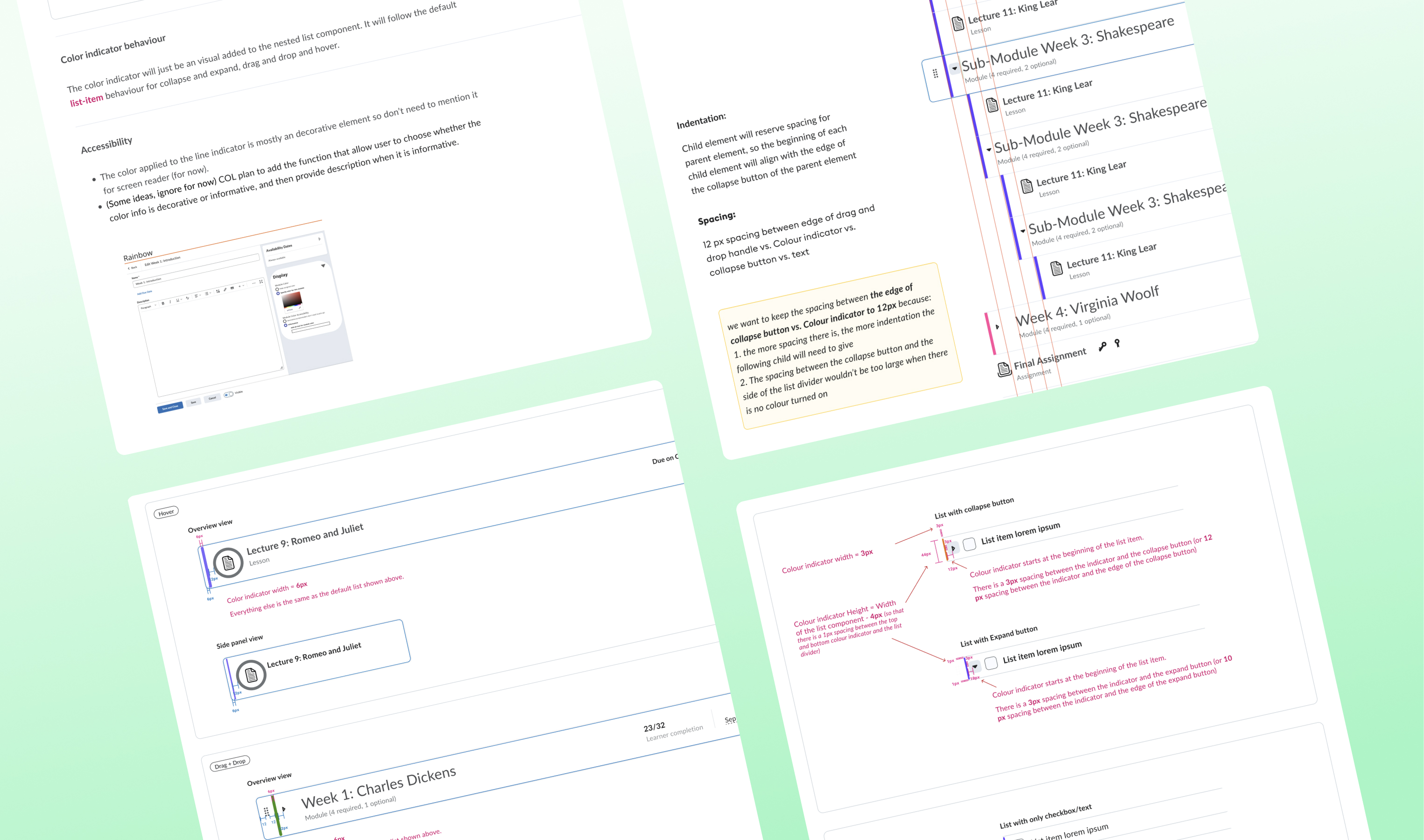
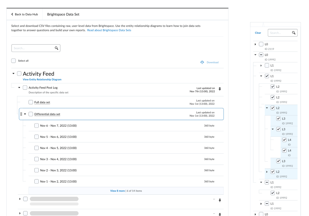
Variable width line indicator
👍 Only show for list thats been expanded: Clearly indicates which lists have been expanded and which have not, aiding situations where users need to constantly interact with list items.
👍 Variable representation based on frame size to minimize visual distraction: Adapts the line thickness (4px on wider screens, 2px on smaller screens) to provide a visible guide without being overly distracting.
👍 Can support color
The exploration doesn’t stop here
With over six tools utilizing the nested list component, it's crucial to test the idea thoroughly across all of them. This ensures the solution is viable in various environments and meets the needs of each tool's unique context.
💡Explore: need 2
Next, I delved into finding a solution for adding color to the Lesson module. Given that the primary requirement is to incorporate color, I identified three areas where we can implement it:
It turns out that the optimal location for adding color is still on the list. So, why not repurpose the "variable width line indicator" solution (6px line on large frames and 3px line on small frames) and simply apply color to them?
💬 Review and critique
Ive met with 6 different designers from different tools over 3 meetings to review the solution and receive feedback.
Config variable that can be turned on and off: The variable width indicator should only apply to deeply nested list (+5 level nesting)
A softer representation: The current component's sharp edges impart a harsh feel. We should aim to convey a softer and warmer atmosphere.
🧐 Refine
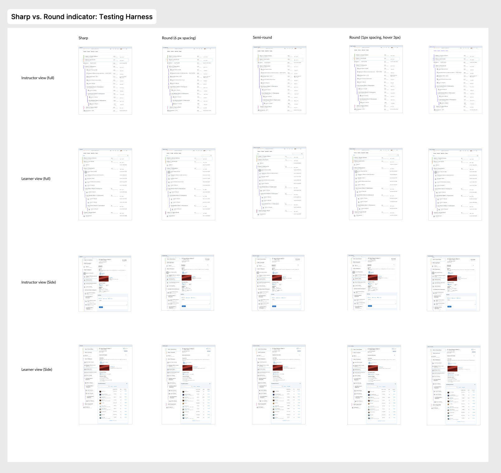
Taking the feedback into account, I explored a rounded-edge version of the variable-width indicator.
Now, it's time to refine the finer details, such as the spacing between different elements and the placement of each element in different modes (default, hover, drag/drop, etc.).
It is also important to define component best practices, and accessibility guidelines.
Testing the UI details with “testing harness”
This technique involves linking all screens from left to right, with different variations linked from top to bottom on a prototype.
By tapping <up, down, left, right> on the keyboard, we can seamlessly navigate between screens and clearly observe the differences between the various ideas.
✅ Hand-off
I closely collaborated with the development team to address any edge cases discovered during implementation.
We maintained a dedicated channel between myself and the developers involved in the project to ensure that conversations weren't lost, allowing for more asynchronous communication which would have been calls.
